BhtLayoutContainer
文档版本:1.0.0
描述
布局容器组件,用于按行列划分区域并承载其他组件。
效果
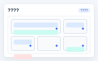
示例
<bht-layout-container></bht-layout-container>
代码
<bht-layout-container :ref="item.id" :item="item"></bht-layout-container>
或者
<BhtLayoutContainer :ref="item.id" :item="item"></BhtLayoutContainer>
参数
| 参数 | 类型 | 必填 | 默认值 | 说明 |
|---|---|---|---|---|
| item | Object | 否 | - | 组件配置信息。 |
| configOnly | Boolean | 否 | false | - |
配置项
item.config.data 支持的常用字段如下:
| key | 名称 | 类型 | 默认值 | 说明 |
|---|---|---|---|---|
| rows | 行数 | string | 2 | 请输入行数 |
| columns | 列数 | string | 2 | 请输入列数 |
| gap | 间距 | string | 12px | 例如 12px |
| columnWidths | 列宽 | string | - | 逗号分隔,例如 1fr, 320px, 25% |
| rowHeights | 行高 | string | - | 逗号分隔,例如 auto, 240px, 30vh |
| margin | 外边距 | string | 0 | 例如 0、16px、12px 0 |
| padding | 内边距 | string | 16px | 例如 16px |
| minHeight | 最小高度 | string | 160px | 例如 160px |
| height | 固定高度 | string | - | 可选,例如 480px |
| cellMinHeight | 单元最小高度 | string | 120px | 例如 120px |
| cellPadding | 单元内边距 | string | 10px | 例如 10px |
| backgroundColor | 背景颜色 | color | #ffffff | 请选择背景颜色 |
| borderColor | 边框颜色 | color | #e5e7eb | 请选择边框颜色 |
| borderWidth | 边框宽度 | string | 1px | 例如 1px |
| borderStyle | 边框样式 | string | solid | 请选择边框样式 |
| cellBackgroundColor | 单元背景色 | color | #f8fafc | 请选择单元背景色 |
| cellBorderColor | 单元边框色 | color | #cbd5e1 | 请选择单元边框色 |
| cellBorderStyle | 单元边框 | string | dashed | 请选择单元边框 |
| cellBorderRadius | 单元圆角 | string | 6px | 例如 6px |
| alignItems | 垂直对齐 | string | stretch | 请选择垂直对齐 |
| justifyItems | 水平对齐 | string | stretch | 请选择水平对齐 |
| cellOverflow | 内容溢出 | string | visible | 请选择内容溢出 |
| borderRadius | 圆角 | string | 8px | 例如 8px |
| boxShadow | 阴影 | string | none | 例如 0 12px 24px rgba(15,23,42,.08) |
| opacity | 透明度 | string | 1 | 0 到 1,例如 0.95 |
| boxSizing | 盒模型 | string | border-box | 请选择盒模型 |
| customStyle | 自定义样式 | string | - | 例如 box-shadow: none; |
| cellCustomStyle | 单元自定义样式 | string | - | 例如 place-items: center; |
引入
import { BhtLayoutContainer } from '@behappyto/cms-ui-vue3'